
A student opens three college websites on their phone. The first one loads slowly and shows a homepage full of text, announcement banners, and a welcome message from the director that takes up the entire screen. The second one has broken links and a course list that goes nowhere. The third one shows clear course cards, a fee structure, real campus photos, a placement record, and a WhatsApp button at the top.
The student messages the third college within 60 seconds. The first two never hear from them.
This is how admissions are won and lost online in India today — not in counselling sessions, not in newspaper ads, but in the first 10 seconds of a website visit on a mobile phone.
Who Is Actually Visiting Your College Website?
Before getting into what a college website must include, it is worth understanding who is visiting — because the answer is not one person. It is two, with completely different needs.
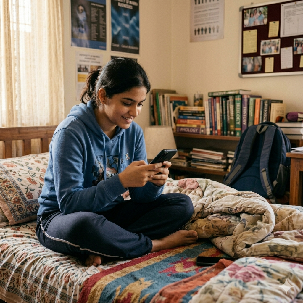
Students are the primary audience. They are typically 16 to 22 years old, browsing on their phones, comparing multiple colleges at the same time, and making fast decisions. They want specific information quickly. They have little patience for dense content or complicated navigation.
Parents are the secondary audience — but often the final decision-makers, especially in India. They are more patient than students, but they are looking for different things entirely. They want proof — proof of quality, proof of safety, proof of outcomes.
A college website that serves only one of these audiences loses the other. Most college websites in India are designed with neither in mind — they are built to impress management or pass evaluations, not to speak to a student or a parent making one of the most important decisions of their family's life.
What Students Are Looking for — And How Fast They Decide
Aaj ki generation mein itna patience nahi hai.
This is the honest reality of building a college website in 2026. A student landing on your website has roughly 5 to 10 seconds before they decide to stay or leave. If the information they came for is not immediately in front of them — they go back and check the next college.
Here is what students are actually looking for, in the order they look for it:
Courses and specialisations — first. Is the course they want available? What are the specialisation options? This must be the most accessible information on the website. A student should not have to hunt through menus and dropdowns to find whether their subject is even offered. Esa nahi hona chahiye ki student ko apna course dhundna pade.
Fee structure. After confirming the course exists, fee is the immediate next question. Colleges that hide their fees behind "contact us for more information" lose students at this step. Transparency builds confidence. A clear fee breakdown tells the student this institution has nothing to hide.
Class schedules and academic calendar. When does the semester start? How are classes structured? Is there flexibility? These are practical questions students ask before applying.
Placement records. Where have your previous students gone? Which companies have recruited from your campus? Real placement data — company names, salary ranges, percentages — is one of the most powerful trust signals for a student evaluating a college.
Facilities. Classrooms, hostels, canteen, sports facilities, gym, library — students want to see the campus before visiting. Real photos, not stock images. An events gallery showing actual student life — cultural programs, sports days, college fests — tells a prospective student what the environment feels like.
All of this should be visual. Not paragraphs of description — course cards with icons, a gallery of real campus photos, placement stats displayed as numbers and logos, an events section with photographs. Students today process visual information faster than text, and a website that respects that reality will hold their attention far longer.
What Parents Are Looking for — And Why It Is Different
A parent visiting the same college website is looking for something completely different.
Where a student wants to know "will I enjoy it here," a parent wants to know "is my child safe and will they have a future."
Faculty credentials. Who are the teachers? What are their qualifications and experience? A faculty section with real profiles, educational background, and years of experience reassures parents that the teaching quality is genuine.
Accreditations and recognitions. NAAC grade, NBA accreditation, UGC recognition, any government approvals — these should be prominently displayed. Parents may not know the full significance of each accreditation, but their presence signals that the institution is legitimate and held to external standards.
Placement statistics. This matters to parents as much as students — sometimes more. A parent investing three to four years of fees wants to see that students coming out of this college get employed. Real numbers, real companies, real outcomes.
Hostel and security facilities — especially for girls. For parents considering sending their daughter to a college away from home, this section is not optional. Separate hostel details, security measures, campus safety information — all of it needs to be clearly addressed. If this section is missing or vague, many parents will choose a different institution regardless of academic quality.
Transparency and authenticity. Parents are more skeptical than students. Vague claims, stock photos, and generic content all raise doubt. Real photos of the actual campus, honest admission process details, and clear contact information build the credibility that converts a parent from curious to convinced.
The Biggest Problem With Most College Websites in India
Walk through the websites of most schools and colleges in India and you will see the same pattern repeatedly.
Pages and pages of readable content. Dense paragraphs about the institution's vision and mission. Banner after banner of announcements. A traditional layout that looks like it was designed in 2010 and never revisited. Navigation so complex that finding a simple fee structure takes five clicks and two wrong turns.
This kind of website was not built for students. It was built for committees, evaluators, and internal stakeholders who already know everything about the institution. It assumes the visitor has time, patience, and motivation to dig through content to find what they need.
Today's student has none of those things.
The fix is not about making the website look modern. It is about shifting from content-heavy to visual-first. Main heading, brief explanation, relevant photograph — this is the format that works with a generation that consumes Instagram and YouTube before reading a single paragraph. Show the campus, show the students, show the events, show the results. Less theory, more evidence.
What a College Website That Works Actually Looks Like
A well-built school or college website in India today has these elements in place:
Visual course cards — each course as a clear card showing the name, duration, eligibility, and a link to full details. No buried PDFs.
Real campus gallery — photos of classrooms, labs, hostels, canteen, sports grounds. Not stock images. Real photos of the actual campus.
Placement section with data — company logos, recruitment numbers, highest and average salary packages, student testimonials from placed alumni.
Clear admission process — step by step, with dates and a visible CTA. A student should be able to understand how to apply in under two minutes.
Faculty section — real profiles with photos, qualifications, and experience. Even a small faculty section with genuine information beats a missing or generic one.
Accreditation badges — NAAC, NBA, UGC — displayed on the homepage, not hidden in an about page.
Events and achievements gallery — cultural programs, sports meets, student competitions, college fests. This section shows life on campus and is one of the highest-engagement sections for students.
Mobile-first layout — everything above must work cleanly on a phone. Course cards that are easy to tap, a gallery that loads quickly, a contact button that is always visible.
Frequently Asked Questions
1. Does a school or college really need a separate website, or is a social media page enough?
A social media page helps with visibility, but it cannot replace a website. Admission information, fee structures, faculty profiles, accreditations, and course details all need a permanent, organized home that the institution controls. A website also appears in Google search results when students and parents are actively looking — social media does not always surface at that moment.
2. How often should a college website be updated?
At minimum before each admission cycle — updated fee structures, new placement data, current faculty, and upcoming event information. An outdated website with last year's dates and wrong contact numbers actively damages trust. A fresh update before admissions open is as important as any marketing effort.
3. Should fee details be listed publicly on the website?
Yes. Hiding fees behind a contact form creates friction and suspicion. Most students and parents are comparing multiple options — if your fees are not clearly listed and a competitor's are, the competitor gets the inquiry. Transparency on fees is a trust signal, not a risk.
Does Your School or College Website Reflect the Institution You Have Built?
Most educational institutions invest significantly in their facilities, faculty, and student programs. The website should reflect that investment — not undermine it with outdated design, missing information, or content that was never written for the person actually visiting.
At SurgeDigitally, we build school and college websites that are designed for both students and parents — visual, organized, mobile-first, and built to support admissions. Whether it is a full website or targeted improvements to what you already have, we approach it practically.
Share your current website with us on WhatsApp and we will give you an honest review — what is working, what is missing, and what would make the most difference for your next admission cycle.
Chat on WhatsApp — or fill the contact form if you prefer.
Written by SurgeDigitally Team — We build websites, web applications, and custom software for businesses and institutions across India.